Corporate gifting
Every gift.
One point.
One point.
This book sets out how Launch Point looks, sounds and moves, in English and Arabic. Use it whenever you make anything that carries the name: the website, proposals, merchandise, rider kits, event signage and social posts.
Launch Point is the single partner that businesses across the GCC call for rider equipment, corporate gifting, events, printing and custom B2B solutions.
To take the complexity out of B2B sourcing. One accountable team, one invoice, delivered on time across the Gulf.
For GCC companies that are tired of juggling five suppliers, Launch Point is the one-stop B2B partner that plans, produces and delivers everything under one roof.
Every need. One point.
The mark is a ring of five gold arcs, one for each service line: rider equipment, corporate gifting, events, printing and custom solutions. They circle a single teal point, which stands for the one partner at the centre of it all. A teal arrow launches out through the one open gap, showing clients' businesses moving forward.
Primary lockup. Use this on Night and dark surfaces.
Light version. Uses Deep Teal and Bronze for contrast on Sand and white.
Bilingual lockup: لانش بوينت. Use this on GCC-facing materials.
Tagline lockup: “Every need. One point.” Use for covers, signage and social.

Mark only on light. Use for favicons, stamps and small spaces.
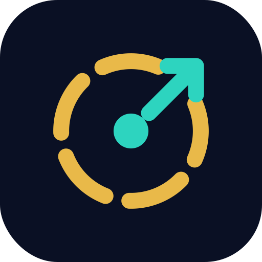
App icon. Use for social avatars, the PWA and WhatsApp Business.
xxKeep clear space of at least x on every side, where x is the diameter of the teal point multiplied by two. Nothing may enter this area.
Lockup min. 24px / 8mm highMark min. 16px / 5mmApp iconStretch or squash it
Rotate the ring. The arrow always exits at the top right.
Recolour it
Place it on busy backgrounds
Night carries the brand. Sand is the warm, readable text colour. Gold marks the five services and every call to action. Teal is reserved for “the point”: the dot, the arrow and live states. On light backgrounds, switch to Deep Teal and Bronze to keep AA contrast.
Colour balance across a layout. CMYK values are approximate. Always proof printed gold against a Pantone reference (close to PMS 7408 C).
Both are open-source Google Fonts with a matching geometric rhythm, so the two languages sit together naturally on the same layout.
Light 300 · Regular 400 · SemiBold 600 · Bold 700 · ExtraBold 800
ABCDEFGHIJKLMNOPQRSTUVWXYZ
abcdefghijklmnopqrstuvwxyz 0123456789
عادي ٤٠٠ · شبه عريض ٦٠٠ · عريض ٧٠٠ · أسود ٨٠٠
ا ب ت ث ج ح خ د ذ ر ز س ش ص ض ط ظ ع غ ف ق ك ل م ن ه و ي
٠١٢٣٤٥٦٧٨٩
Every page, form and asset ships in English and Arabic. The Arabic version mirrors the layout and uses Arabic-Indic numerals throughout.
In Arabic, show every number (prices, phone numbers, dates, counts and step numbers) in Arabic-Indic digits. Store data in Western digits. Convert only for display.
The brand does not use stock photography. Its visual language is made from line icons, big typography, the five-arc ring and the launch arrow, so every surface looks like Launch Point and nothing like a template.
24px grid, 2px stroke, round caps and joins, matching the ring. Use Gold on Night, or Night on Sand. The five service icons come from the brand kit.
The five-arc ring (used as the service orbit and the stat rings), the launch arrow, the pulsing teal point, outlined numerals and the gold-to-teal gradient.
Use only real client work, products or your own team, in natural light. Use navy-graded duotones and never generic stock.
The logo animation is the brand's motion signature. The ring spins in, the five arcs draw one after another, the point pops and the arrow launches. Everything else follows the same rhythm: 200–600ms, ease-out, always moving forward and up. Always respect reduced-motion settings.
Download the animation as MP4, GIF or live HTML/SVG.
Key words rotate upward every 2.6s. Use this in hero headlines.
On the website, the arrow swings to whichever service is active.
A slow sweep across gradient text. Use it on one element per screen at most.
Write the way a trusted account manager talks: short sentences, concrete promises and no jargon. Lead with the outcome for the client.
“Rider kits for 500 couriers, branded and delivered to Riyadh in 10 days.”
“We leverage synergistic end-to-end solutions to empower stakeholders.”
“One team. One invoice. Every GCC city.”
“WORLD'S #1 BEST SUPPLIER!!!”. Avoid unproven superlatives and shouting.
Business card, front: 85 × 55mm, Night with gold foil
Business card, back (sample details)
Social post: 1080 × 1080, typographic
Email signature: mark at 52px, gold keyline, and no images other than the mark.
Use the vector SVG wherever possible. The full kit includes the logos, service icons, motion files and the Sora and Cairo fonts (SIL Open Font License).